Romstal, a company specialized in the sale of construction installation equipment, is the market leader in South-Eastern Europe. The company’s offer includes over 15,000 products, characterized by a world-renowned quality, which Romstal adopts as its policy.
However, Romstal’s website hadn’t been updated in a long time and its UX (User Experience) didn’t respond to the business and user needs anymore. The overall look and feel was outdated and no longer conveyed the brand message. The main problem was that the site had a high bounce rate and low returns on marketing investment.
With all these challenges in mind, our UX team developed a three-step plan, following a model successfully implemented throughout other similar projects. The results were soon to follow.
Rethinking and redesigning the user experience, every step of the way
We considered Romstal’s specific needs and decided to adapt our tried and tested three-step approach to Romstal’s business needs, goals, and target audience:
- Discover & Collect. This stage included a thorough review of Romstal’s existing website. We got a clearer picture of what the new Romstal website should look like, after carrying out:
- stakeholder interviews
- analytics reviews
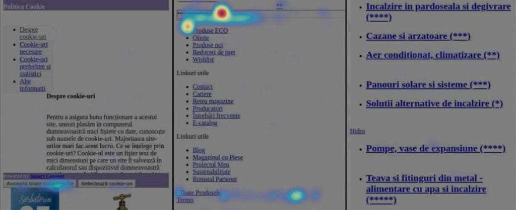
- heatmap analyses
- heuristic evaluations
- competitive analyses
During the Discover & Collect phase, we gained useful insights that helped us grasp a better understanding of the approach we should take in the following stages:
- Romstal differentiates itself from its competition by offering consulting services, spare parts, and also through its positioning on the ECO segment
- The focus on the online environment must be reoriented on end consumers, not professionals
- The ratio between new and returning users is quite unbalanced vs. the number of site visits: 70.7% – new visitors vs 29.3% – returning visitors
- Although there are many more new users, those who buy from the Romstal site are mostly returning users
- 31.5% of users who reached the homepage left the site without visiting another page and another 55% of them used the search field in the site to reach a page of results
- The banners section is not of interest to users. This area needs to be rethought.
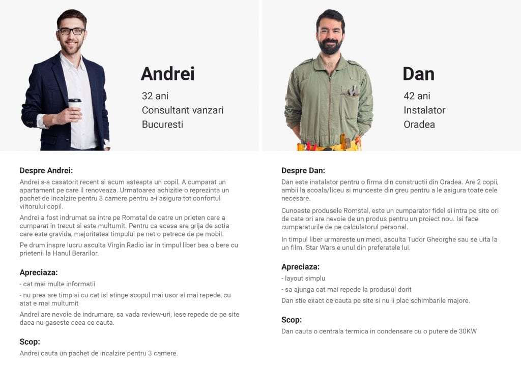
- Analyze & Plan. With all the information collected in the first step, we were able to identify two primary personas with different needs and goals. Then, we created two different journey maps. To make sure we were taking the right path, we held user interviews and had our questions answered through a series of exercises.
Here is how the card sorting & user interviews stage took place for the product categories menu:
- First, we used an open card sorting method. Each participant received a package of tickets containing between 4 and 6 products from each main category in the menu. The products selected to be presented to the participants were some of the best selling products on the Romstal website.
- Then we gave them the actual categories and asked them to fill them with products that they think are part of that category.
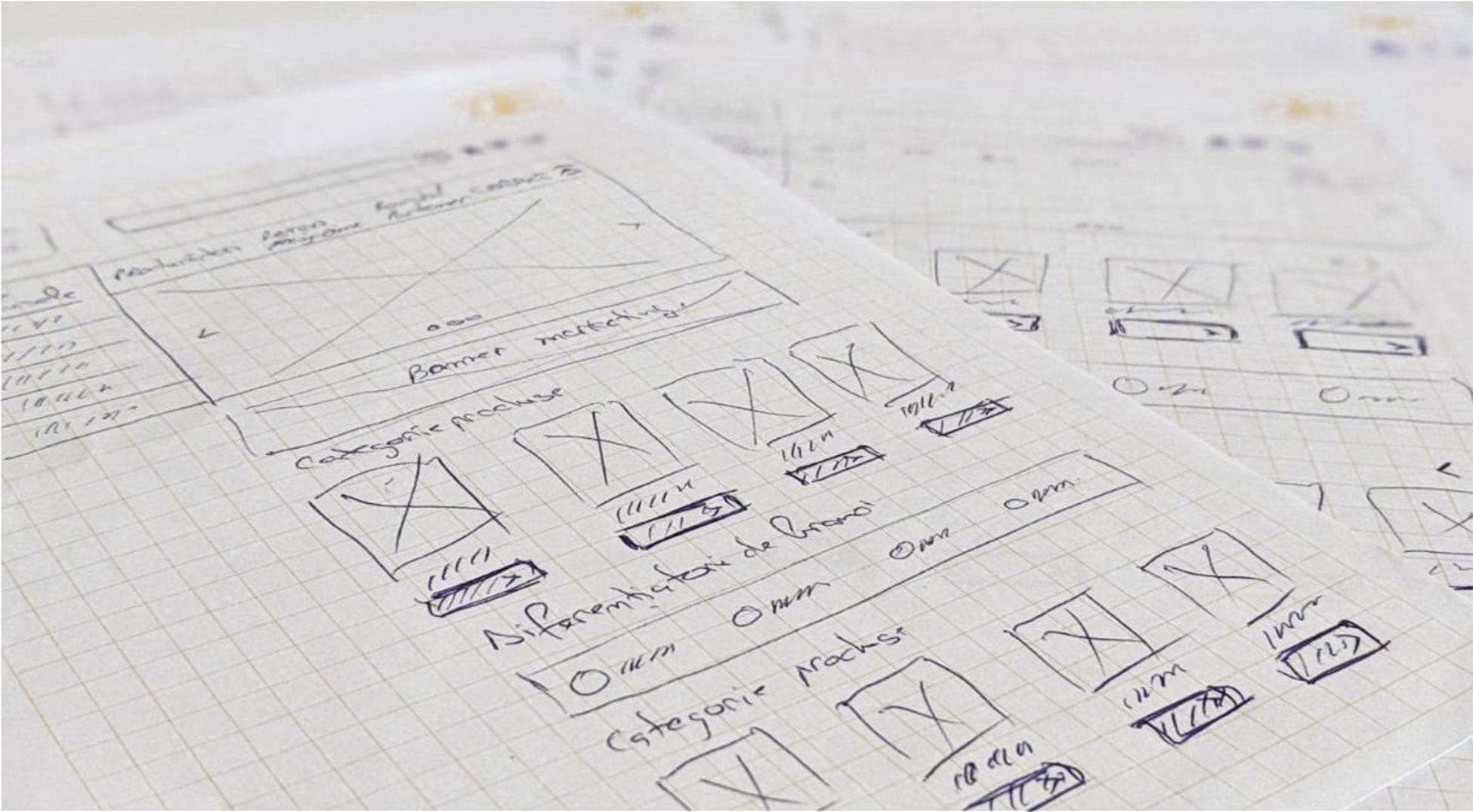
- Ideate and Create. Before reaching the final design, we went through various sketches, wireframes, prototypes, and of course, a lot of testing. But in the end, it was all worth it, as both the mobile and web versions of the website lead to a significant increase in revenue.
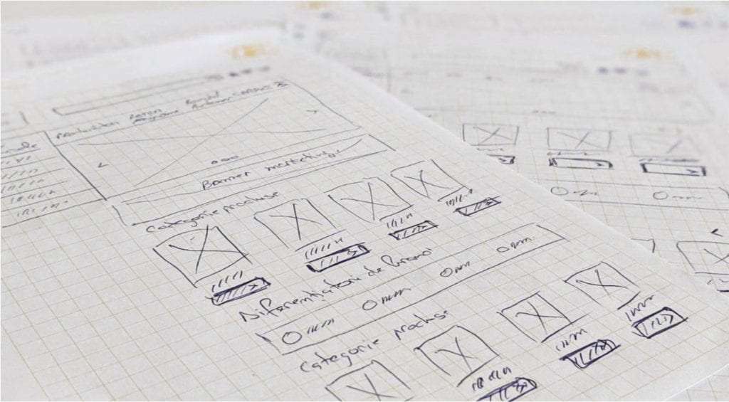
This stage enabled us to build a prototype in Adobe XD. It was also the time to go with only one version for the homepage. To do that, we showed both versions to some users and asked them to give us the pros and cons of each proposal.
The process that followed was one of continuous design and testing that led to a result that we were sure would benefit both the users and customers.
The results were soon to follow – 53% boost in web revenue
When it comes to eCommerce websites, it’s all about user experience and best practices that lead to conversion rate optimization. The below metrics are measured in just eight months since the launch of the new website:
- On web: 114% more transactions, 79% higher conversion rates, 15% more traffic and the bounce rate was reduced by 60%. All these lead to a strong 53% boost in revenue.
- On mobile: 134% more transactions, 83% higher conversion rates, 28% more traffic and the bounce rate was reduced by 61%. All these lead to a strong 48% boost in revenue.
Let’s talk about your project
If you’ve decided to take the path to innovation and growth, we are happy to help.

Share via: