The overall aesthetics and usability of a website are decisive factors for any user to stay on the page. A user-friendly interface, created based on customers’ needs, will attract and retain both new and existing consumers. This is why it is most important to offer positive experiences on a web page or on mobile apps. To uncover your website potential and to eliminate any negative experience for the users, a UX Audit is the answer.
And this is exactly what The Bucharest University of Economic Studies (ASE) opted for. In the following lines we bring to your attention a proper UX design Audit performed for ASE, one of Zitec’s clients. What it actually means, how it’s done and the recommendations that once implemented can enhance the website’s user experience, you can only find out if you read further.
A UX Audit - What you need to know
1️⃣ What a UX Audit is
A UX Audit, also known as a UX Expert Review, is a usability and customer experience inspection method performed by a UX specialist. More precisely, the expert examines a website or an application to identify any usability problems.
2️⃣ The critical information a UX Audit can depict
Specialists perform UX design Audits to understand the root cause of any UX issue, no matter the online environment. However, it’s only fair to point out that an Audit is not a fix-all solution for a failing website or app. Especially, you don't put into practice the UX recommendations. But, as a first step, an audit does provide answers to certain questions:
- What is and isn’t currently working when it comes to user satisfaction?
- How user-friendly is your site and are there any usability pain points for your customers?
- Which are the metrics you are analyzing and which are those you ought to gather?
- What does the data insights tell you about your user’s needs?
3️⃣ UX Audits always drag along many benefits
A UX Audit can undoubtedly be beneficial for the majority of online businesses. A well-conducted audit enables them to recognize the friction points consumers are experiencing on a website or an app and then address it. Let’s dive deep into the general advantages of an audit:
- Experts analyze concrete facts and come up with practical follow-up actions
- The audit leads to strategic design plans that can be applied to upcoming adjustments
- The metrics and results of an audit show the causes of users' actions as well as the potential future behavior
- It solves issues like high bounce, churn or drop rates, copy and navigation ambiguity
- A UX audit ends with the specialists’ recommendations and, if implemented, they can result in a website with improved functionalities, increased conversions and ROI
4️⃣ The right team and the right moment to conduct a UX Audit
Alex Axon, Zitec’s Chief Experience Officer, “Ideally, a UX Audit should be performed as part of the QA process whether a significant product, website, dedicated app is released or updated or before similar redesign projects. I also recommend periodic UX Audits to ensure your product meets your business goals and user’s expectations.”
When it comes to the best team to handle the job, here’s the silver lining. Indeed, internal teams have direct contact with the business’ background and cost less, but, if they’re doing an audit for the first time, often this implies a learning curve, time and energy spent. Expert third parties, on the other hand, have the necessary UX & UI experience and knowledge to lead you to the best results quickly.
5️⃣ UX Audit or Usability testing?
A UX expert checks even the most minute details on your site, understands your user personas, analyzes each user scenario, implements mobile first UX wireframes or performs final reviews. Yet, there are some features and issues that are more likely to be put through their paces with usability testing rather than a UX audit. To find out the differences between these two methods, read the UX Audit vs Usability Testing – When it’s best to choose each?
Let’s talk concretes - a client’s project and goals
When it comes to a University’s website, its aesthetics and how user-friendly the platform is are the factors that attract students. One such institution is The Bucharest University of Economic Studies (ASE). ASE is the leader of economic and public administration higher education in Romania and South-Eastern Europe. The Ministry of Education regards The Bucharest Academy of Economic Studies as an advanced research and education university.
Over time, as the business grew, ASE’s board leaders noticed that the amount of educational fields, courses and announcements grew as well. ASE realized it was time to refresh their website aesthetics. Thus, they needed to better map the online information so that the website won’t become overcrowded, less consistent and user-friendly. Therefore, a UX Audit uncovering the usability problems at the time was required. For this, they created a list with all the goals of their project:
- improving the entire information architecture of the website so the users would easily find what they are looking for
- facilitating users’ journeys
- simplifying the access to relevant information
- giving recommendations for an increased accessibility on the website
- improving the content
- UI improvements for a more modern, cleaner, mobile first look
- maintaining the University message and brand
ASE’s user persona and scenarios
For every project Zitec handles, our experts focus on several situations that could impact the activity of the specific user persona targeted by our clients. In our case, ASE. Moreover, in this particular UX Audit, we took into account all the University’s students, candidates, administrative personnel or professors and ran different scenarios such as:
- how easy-to-use the website is for those who want to join the Bucharest University of Economic Studies
- how fast one can find information about the admission process, accommodations, activities, Bachelor or Master’s programs
- the possibility to pay the tuition fees
- issues when logging into the platform or learning about any upcoming conferences, workshops or events
- searching and discovering relevant documents in a timely manner
- if there are any difficulties when authenticating in the homepage section
“The team’s professionalism is outstanding and I loved their capacity and desire to come up with the best solutions to our needs and pain points. Communication skills, proactivity and recommendations are top notch.”
Conf. Univ. Dr. Florina Mohanu, Marketing and Communication Director, Bucharest University of Economic Studies
Where ASE’s UX Audit led to
Zitec’s UX team identified the pain points in the user experience and established a final score based on the design rules we follow. Our goal was to provide ASE with data-driven recommendations and to make them as applicable as possible, so that we can quickly achieve the desired result: UX improvements.
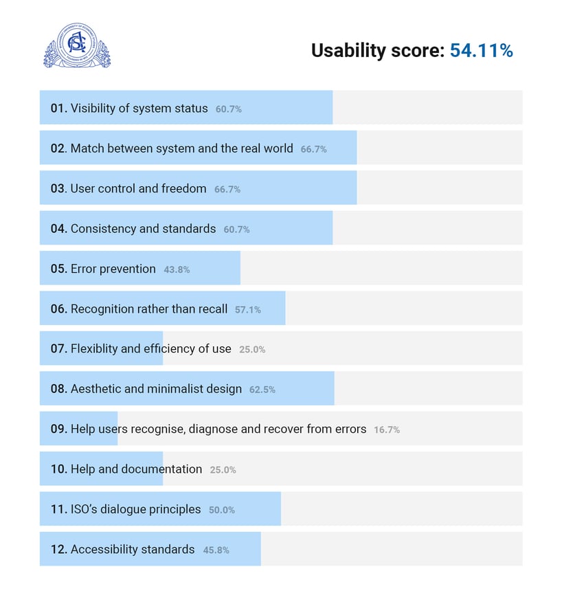
Top UX findings and recommendations
For this project, our UX specialists checked ASE’s website on desktop and mobile devices. We will further dive deep into the most impactful 8 usability findings and our experts’ recommendations.
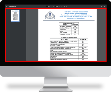
1. Issue: Content on the site is presented in the form of documents (.doc, .pdf)
Impact:
- these documents are hard to follow especially on mobile devices
- difficult navigation
- negatively impact on the overall aesthetics and content consistency
Severity: Major
Location of the issue: on the main search menu or other menu sections on the site
Recommendations: Eliminate this type of content display and create web pages with interactive content
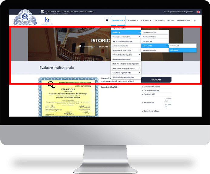
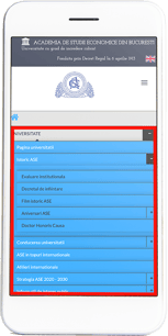
2. Issue: Navigation and accessibility on the site are difficult for the visitor
Impact:
- in the dropdown menu, the text fonts did not correspond with the accessibility and visibility standards
- too many subcategories in the dropdown menu
- the animation of the menu makes the navigation quite difficult
Severity: Medium
Location of the issue: main page
Recommendations: Maintain the same content font as those in the principal menu and reduce the subcategories number, as well as improve the animation design
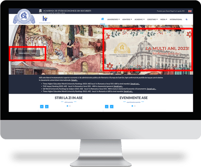
3. Issue: The visual style and the interactive elements create confusion for the readers
Impact:
- the page has the same design style for the titles of the images and the actionable links
Severity: Medium
Location of the issue: homepage
Recommendations: Either display only the titles or change the font style of the links
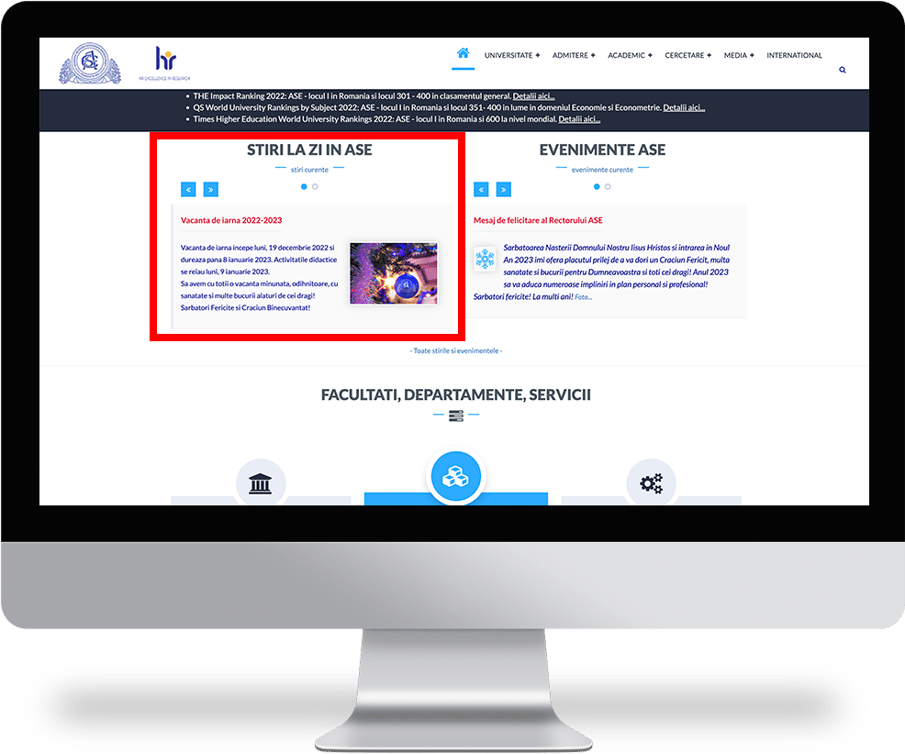
4. Issue: The news/events button and some content details do not respect the visibility standards
Impact:
- all the news and events are hard to be read due to their display system
- the redirect button is not visible enough
- the news title has a hover style, but the news can be accessed only via a small button on the page
Severity: Medium
Location of the issue: Events/News section
Recommendations: Enlist all the news and events; create content and images that can be viewed simultaneously; a bigger redirect button; proper alignment and better spacing between the elements; clickable titles
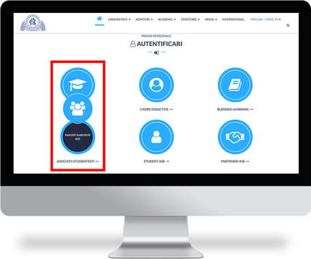
5. Issue: Pages not requiring authentication are displayed in the wrong section
Impact:
- student associations and ASE’s partners are wrongly displayed
Severity: Medium
Location of the issue: Authentication section
Recommendations: Keep on this section only those pages that require authentication and account creation
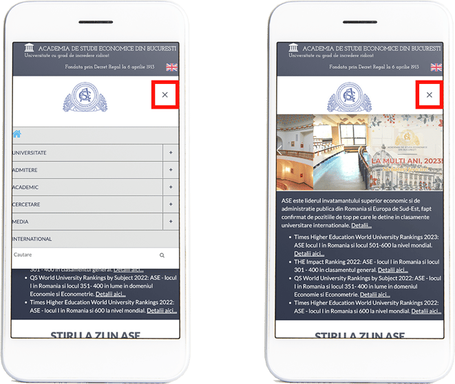
6. Issue: Inconveniences in the navigation menu
Impact:
- if the user clicks on any area on the page when the navigation menu is opened, the menu disappears, but the closing (X) option is still displayed on the page
Severity: Major
Location of the issue: homepage
Recommendations: Check the menu functionality and allow the user to close it only when clicking on the X sign
7. Issue: Texts in the navigation bar are not properly visible
Impact:
- the content fonts have insufficient contrast with the background
Severity: Major
Location of the issue: homepage
Recommendations: Change the colors for the content and the background
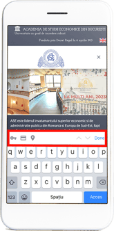
8. Issue: The searching function is not accessible on mobile devices
Impact:
- on mobile devices, users have no possibility to search or write any keyword they are interested in
Severity: Major
Location of the issue: research bar on mobile devices
Recommendations: Check the research section and display a cassette for keywords research
A UX synopsys
The objective of the above design-related recommendations was for ASE to reach tangible results and level up their functionalities to attain user satisfaction:
✔️ clear and easy-to-follow pages
✔️ content, visuals and CTAs that resonate with the users
✔️ possibility to convert more users/subscribers
✔️ better understanding of the ASE user personas
✔️ tailored marketing communications
✔️ less confusions or frustrations
✔️ improved website performance
✔️ reduced development costs
The bottom line is that in order to thrive in a competitive industry, you should always keep your consumers in mind. A UX Audit conducted by knowledgeable designers can make a huge difference in your online presence and business success. Our team has an experience of almost 20 years and has the UX know-how to address the design issues head-on and remove obstacles that stand in the way of your business goals.
Contact us to help you audit and redesign your website so that you can offer your users the best experience possible.

Share via: